Resource Allocation
Companies today require a time and attendance application to determine key performance indicators that are impacted by time-related data, we as a financial institution have adopted a time recording tool, and is mandatory for our personnel to record all the time that they spend by product. This application generate large sets of data but as of now, most of it is used only as a post-facto measure, by end of quarter or year. The main reason is because the data relates to multiple areas, and most of the relationships are n:n; a person can dedicate their time to one or multiple products during a particular time and a product can have multiple persons working on them, additionally, the context of the personnel and the operation are key for a meaningful analysis; with 26 offices, more than 2000 persons at a given time, 18 areas of development and more than 3000 products active, an up-to-date analysis becomes challenging and with low probabilities to be easily digested by users.
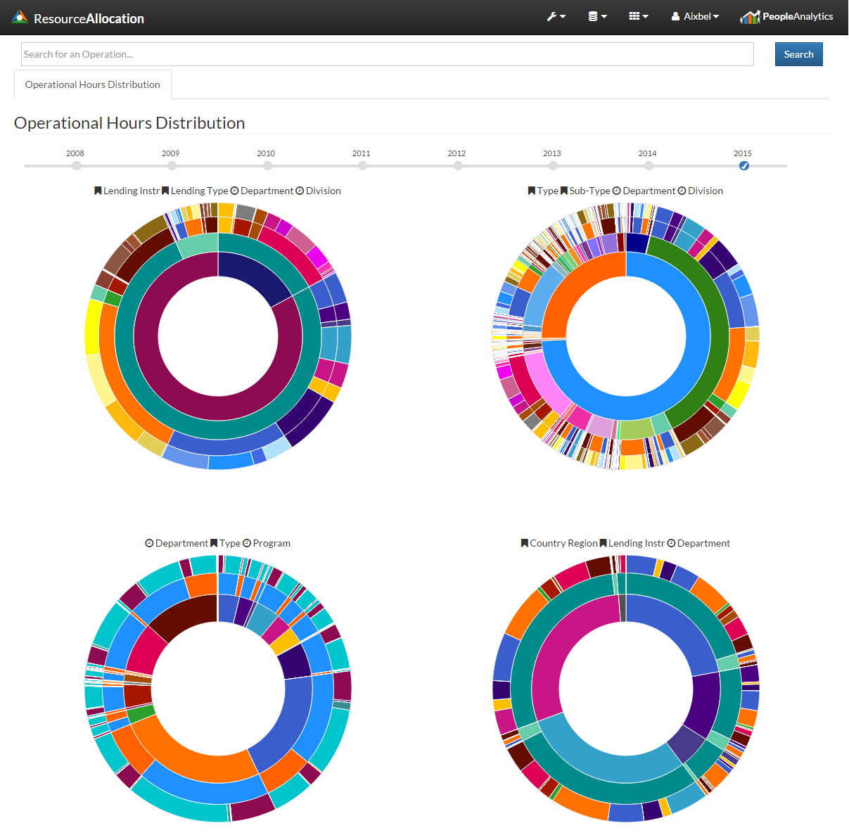
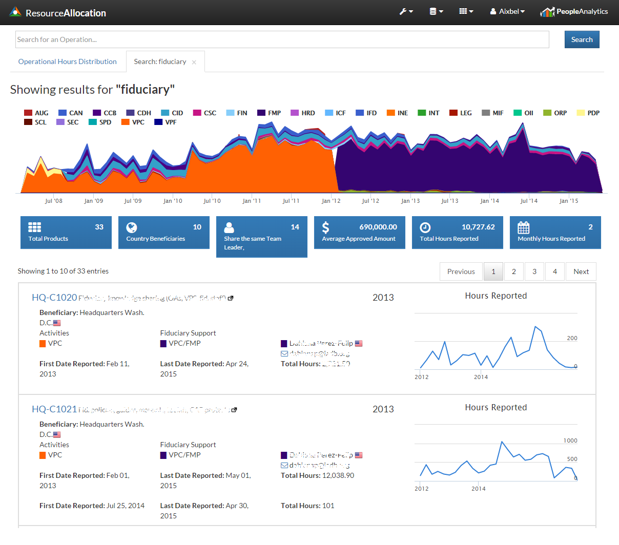
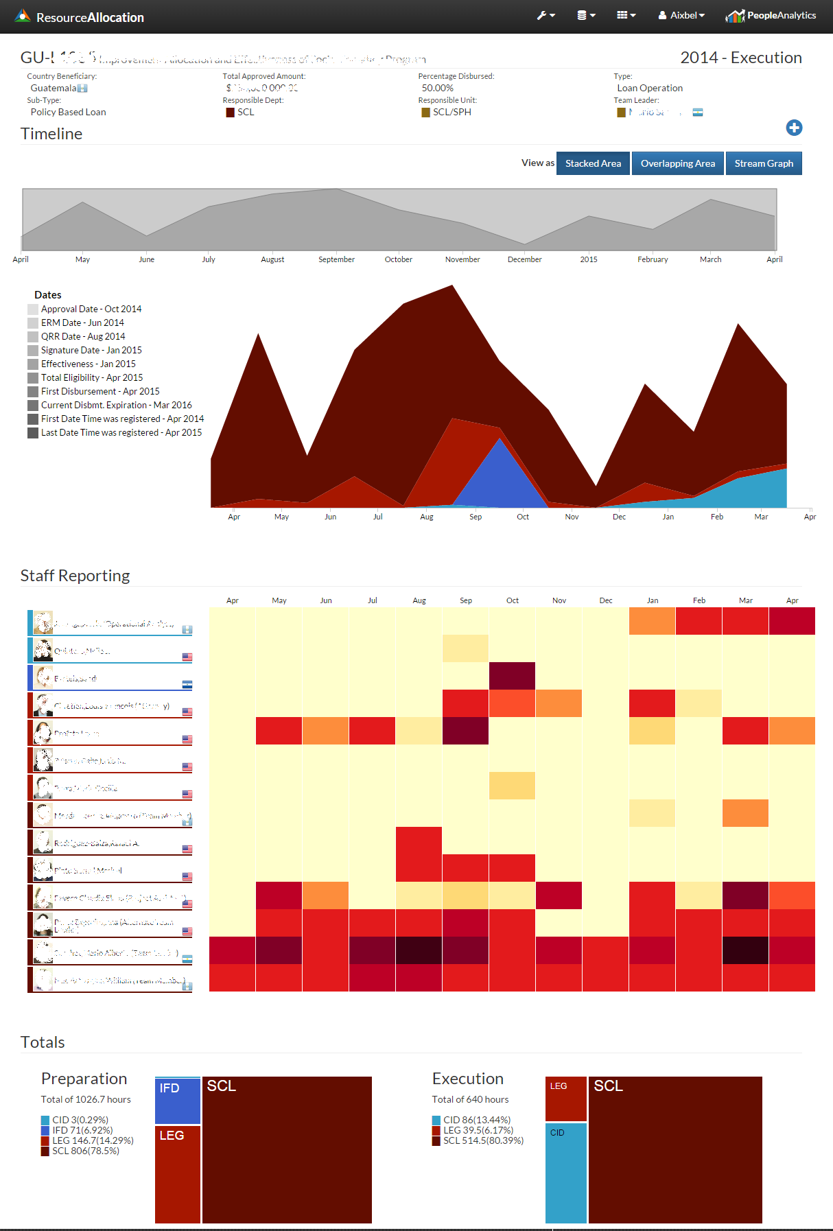
Instead of answering all the questions I decided to divide the most relevant areas and created a dashboard that provides a dynamic analysis of the data (based on the point of view of the user), and additionally offers a day to day tool to coordinate personnel and workload analysis. Resource Allocation is the dashboard that summarizes the reported time from personnel. It allows users to follow each product by all the staff hours reported throughout it's lifetime. Also, allows users to analyze the hours reported by each staff member based by the organizational structure. Includes interactive visualizations that allows to search using key words from products, displays:
- Trends of time spend by department;
- Time allocated by product;
- Personnel involved on a product;
- Hours grouped by organizational structure.
These views coordinate multiple levels of abstraction to enables detection, isolation, and understanding of personnel allocation and performance indicators. With the utilization of: areas, tree maps, heat maps, sunbursts and alluvial diagrams, this dashboard is capable to provide relevant information that can be easily understood by any user, through any device. It was developed using for the front-end: d3, jquery and html5; and for the back-end: C# .Net web services and SQL Server database.
The database plays an important role on this dashboard, since most of the logic of the charts is embedded directly on pre-populated tables, where the data is stored already optimized for d3 interpretation. Several jobs run daily to ensure the data availability and to improve the user interface response time. In the end, this rich data visualization tools provides our user with relevant up-to-date information and allows them to control and contribute more significantly to the overall strategies of the institution.